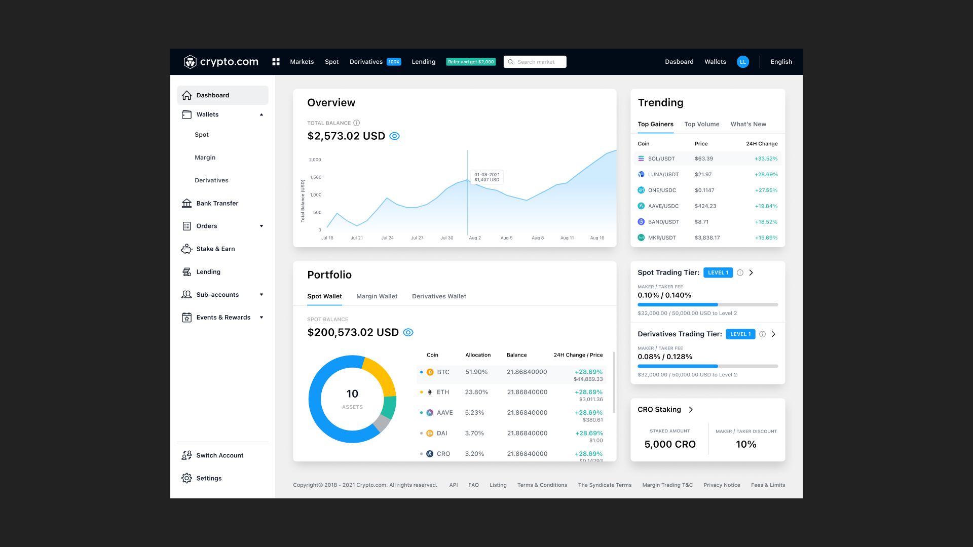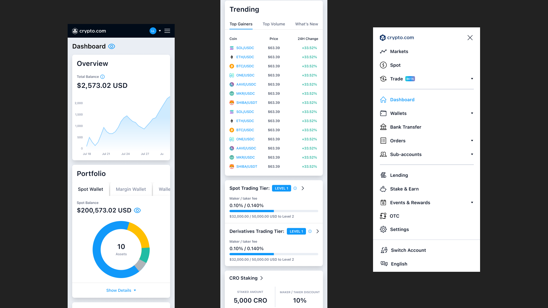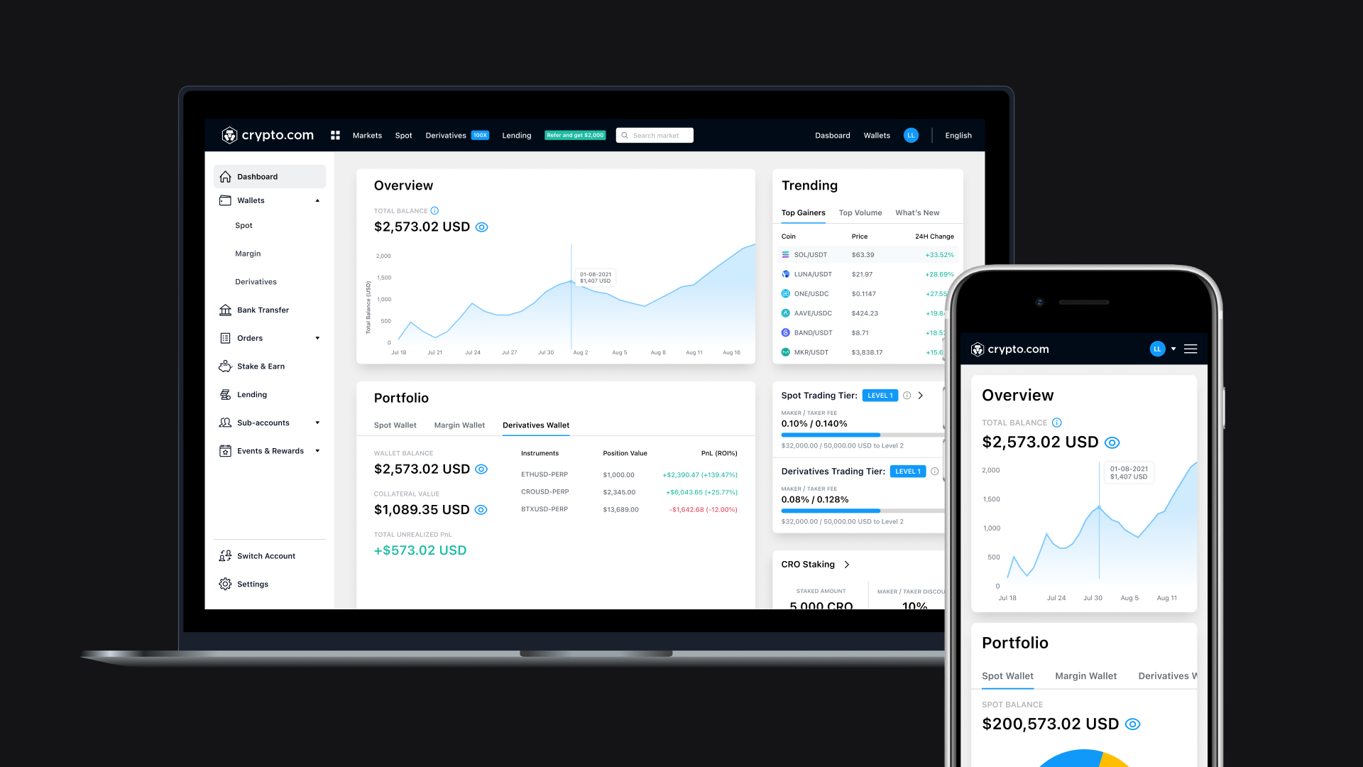
The new design received highly positive feedback from users. The dashboard now delivers more meaningful, in-depth insights, giving users a clearer view of their balances and statuses. The updated navigation is also much clearer and far more scalable, making it easier for the interface to grow alongside the evolving Exchange product. This project not only elevated the overall user experience, but also established a solid design foundation for future features.
The Exchange primarily serves advanced traders and institutional users, and has been part of Crypto.com since its inception. However, the design had become outdated over time. Continuously adding options to the horizontal navigation was no longer sustainable, especially on mobile web. Keeping these challenges in mind, I started by collecting user feedback and initiating ideation sessions to lay the groundwork for a needed redesign.
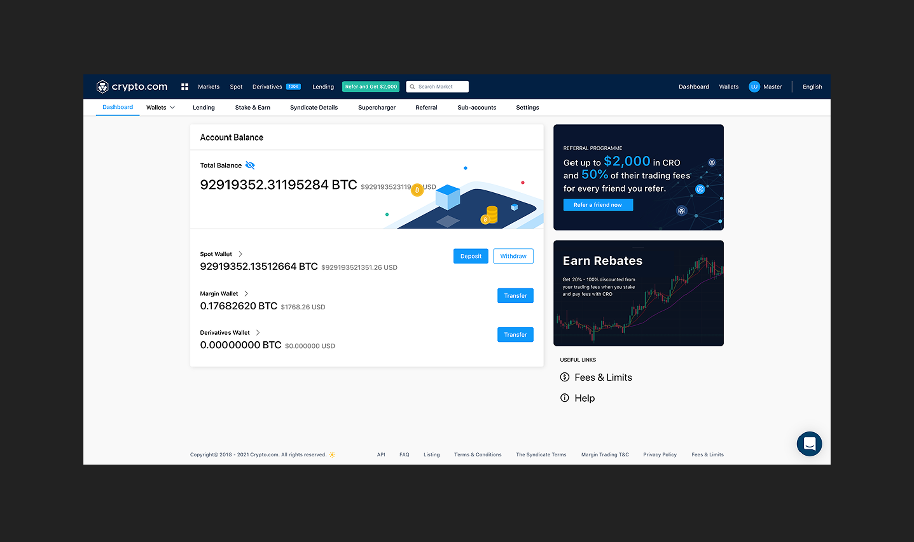
In the previous dashboard design, the layout was simple and straightforward. It showed users the balances of all their wallets, with marketing banners and useful links placed on the right hand side of the screen. A secondary navigation bar at the top allowed users to move between wallets, settings, and related products. For the redesign, the goal was to transform the dashboard into a more insightful overview that went beyond basic balances, while also rethinking the navigation to make it easier for users to find what they need quickly and confidently.
Ideation
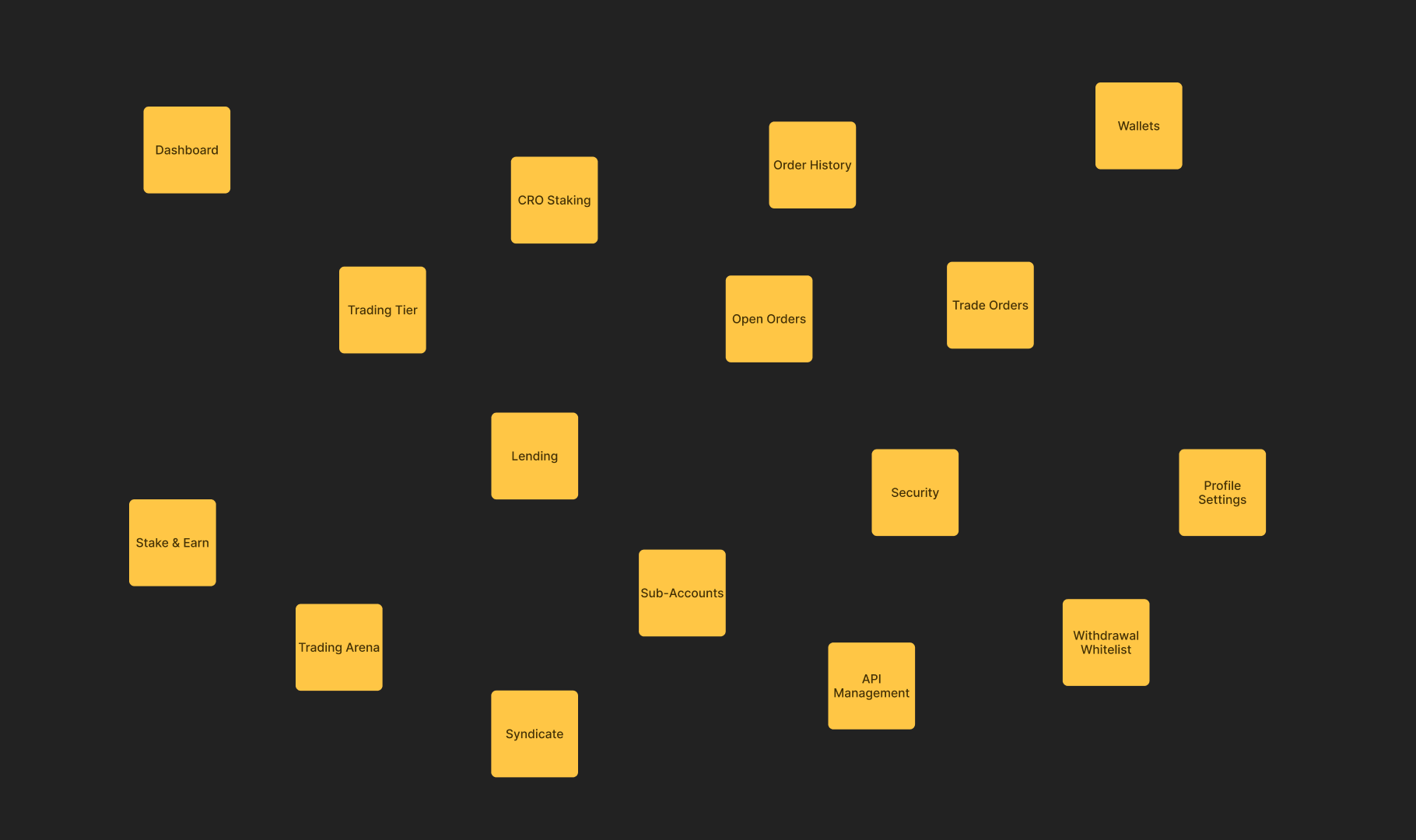
To review the navigation hierarchy, I started with hosting a simple UX workshop with the team, where we mapped out all existing entry points in the Exchange and grouped them into clusters in a way we thought made sense. This exercise helped establish the foundation for a new, more scalable navigation structure.
Then I started ideating on what users would actually want to see on the dashboard. I did some competitive analysis, interviewed colleagues who actively trade on crypto exchanges to gather insights and feedback, and identified unique Crypto.com perks we could highlight. These inputs informed the initial ideation and shaped the direction of the redesigned experience.
Key features
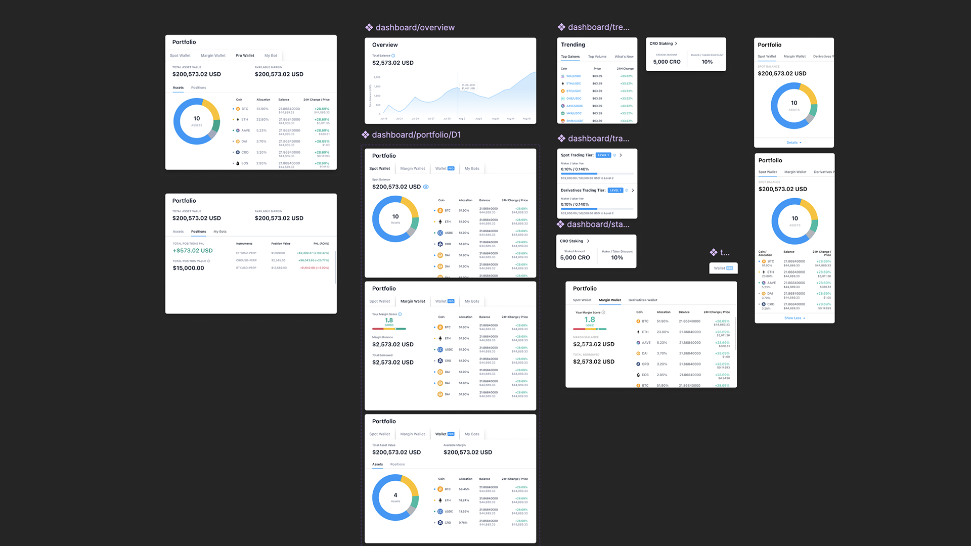
Based on the insights and feedback I gathered, I chose to incorporate several key features into the new dashboard:
A clear overview of the user’s total balance, with a chart to visualise the movement of their balance.
Portfolio details with tabs for quick access and overview to different wallets.
Highlights of trending cryptocurrencies to trade.
Display of the user’s trading tier(s).
CRO staking amounts and associated maker/taker fee discounts.
These additions proved to be the most relevant and engaging for users, ensuring the dashboard delivers meaningful value and supports their trading activity.